Part 3
See also: Part 1 for Display and Design
and Part 2 for Camera
Software and features
+++++ Samsung further simplifies Touchwiz, taking it one step closer to Google stock experience. The main advantage of this is that the skin no longer feels like a resource hog (but whether it really is or not is another matter).
Further de-bloating has been carried out as you’ll find a Moto-style breakup of its ROM. Only basic / trademark features are kept on the device out of the box, but extra features can be downloaded from Samsung Apps store. Case in point, look at the screenshot below – Sound & shot used to be bundled into the camera app. No more.
+ S-Voice. Not that it’s used much because there is Google Now but Sammy has spent time to improve upon its voice assistant. Worth mentioning is the fact that the app no longer occupies the entire screen but instead it tucks into the bottom and out of the way, making a whole lot of sense. It shows you it’s listening when it needs to be and displays a little question mark for help should you need it.
+ well done to Samsung for making a fair effort in copying adopting Apple’s press-action fingerprint sensor to replace their swipe-action as seen on the S5. It’s still not as accurate as Apple’s but it’s not as difficult (error prone) to use now.
+ Settings has finally been cleaned up. Previously it was a mess – Samsung categorised them into meaningless tabs and you’d usually have to go through each page in order to find what you’re really looking for. Now, it’s all been listed in one single page, just like how stock Android does things. Fortunately, Samsung also added a Quick settings section at the top where you can pin frequently accessed items to the top. Good thinking.
—– the Edge screen is an absolute disappointment. The only time it’s useful at all is when the screen is locked. And even then, it just isn’t very useful. Samsung has no excuse really. Edge isn’t a brand new feature. It’s already been 6 months (more, if you count their 2013 showcase) since it’s been on the shelf living on the Note Edge. If they were going to release a flagship around the feature, they really should have beefed its functionality up some.
The settings screen actually explains it all- there’s Edge lighting, People edge, Information stream and night clock.
Edge lighting and People edge
You can set 5 contacts into People edge where it can be quickly accessed with the tiny tab at the side of the screen that’s designed to remind you it’s there. Each contact will be automatically assigned a colour and you can go in and pick one if you like. When – or if – you turn your phone over, (and only if you’ve setup People edge) the Edge lights up when you get notifications. And they will be in the same colour as defined when you added them to Peopl edge. Useful for people who do turn their phones over to reduce the amount of distraction but still wants to know if anybody important is trying to contact them.
But is it of great value.. well it’s there if you need it.
Information stream
When the screen is locked, rub the Edge as though it were a Genie lamp and the Information Stream will light up with tickers and notifications. It’s that idiotic.
Arguably this function has potential but that potential is so far off you’re more likely to see the tip of Mount Everest without climbing it than seeing this come to fruition. So far, there are only a handful of tickers that you can add to the Edge and they’re not particularly useful either. Activating the stream will light up the Edge, and from there you have to scroll to the ticker you’re actually looking for, rather than you know, displaying a bunch of essential information that summarises all the different sources of info you wanted to see. Because quite why anyone would want to scroll through stuff from such a tiny area is anyone’s guess.
The purpose of Information stream is unclear as putting widgets on the lockscreen will accomplish the same, but better e.g. bigger screen real estate to display more information. You could argue that lighting up the entire AMOLED display uses up more battery but hey if they really had wanted to save battery in the first place, they could still just light up the widget only rather than the entire lockscreen.
—- cannot sort apps into alphabetical order. seriously wtf Samsung? Looks like somebody was a little over-enthusiastic with the de-bloat?
Night clock
It’s a clock that shows up at night. Right on the edge. So yes something Samsung can claim as another feature for the S6 Edge. Am blown away.
Sound
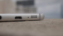
++++ the speaker quality is a bit of a surprise. It doesn’t have the bass but it’s not hollow and tinny either. Even at max volume there is no crackle and pop which is a pleasant surprise and a half.
—- still no stereo speakers! nevermind front-facing ones. At least, Samsung has finally decided to remove it from the back of the device and is now placed at the bottom, just like how Apple does it, but this doesn’t merit any praises.


You must be logged in to post a comment.